Most of us have been hearing of exactly how much oil and LNG (Liquid Natural Gas) the United States sits on top of, but if you’re anything like me, I can’t really envision such a thing.
Color me thick, but I really do have quite a problem wrapping my mind around something of such enormity.

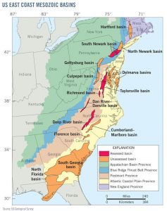
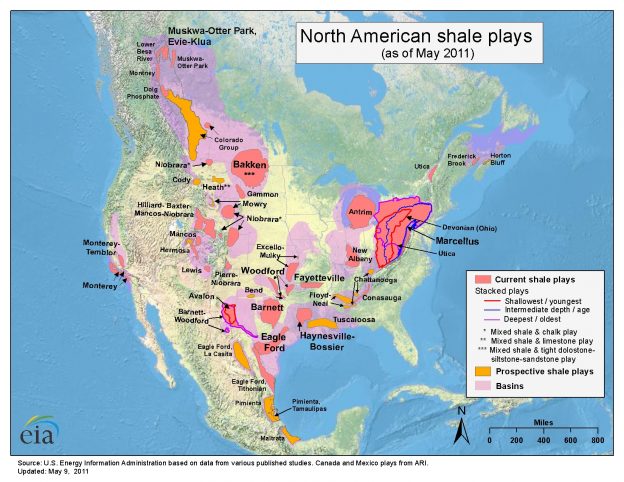
Luckily for me, in-depth color-coded geological maps make things a bit more understandable. As seen in the above map, the vast areas of both known and prospective known oil and LNG sites (technically called “plays”) is actually quite stunning.
Then looking at the map to the right, the areas color-coded in dull orange note “unassessed” (not yet tested, but geologically probable) for plays of oil and LNG. Red being assessed as positive for oil and LNG, but no active drilling.
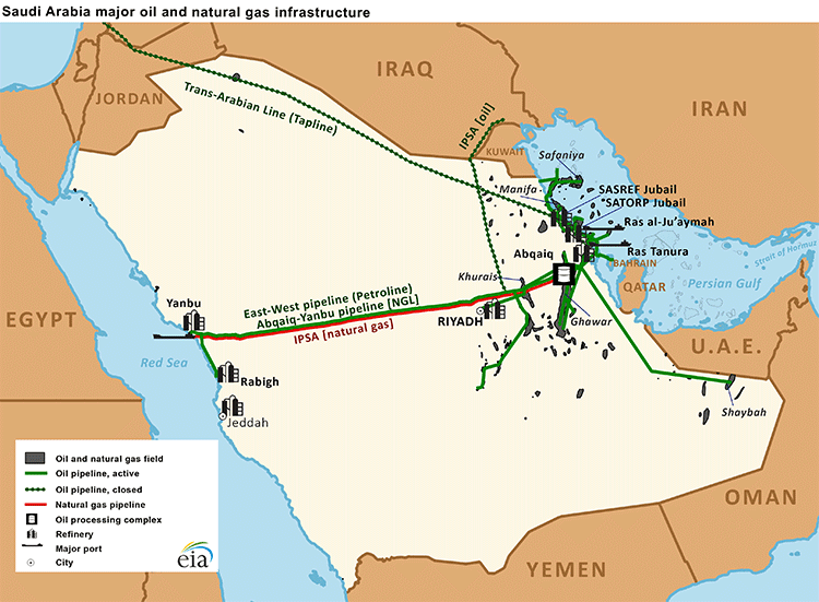
Imagine that… from the Florida Panhandle all the way to the Massachusetts – Vermont state line, what at least appears to my untrained eye as at least rivaling the Saudis (map below).
Knowing that most of us have been literally raised with the idea planted in our heads that under the sands of Saudi Arabia there’s some sort of ocean of oil, we naturally look to them as somehow being the big boys when it comes to crude oil production.
Keeping in mind that the United States is 4.6 times larger than Saudi Arabia, their reserves of oil look pretty shabby when compared to that of the Unites States.

